Carman Creative
back to leadership

// L01 — Enterprise Brand Transformation

Beacon Health Options → Carelon

Transforming an enterprise brand through organizational change.
OrganizationBeacon Health Options → Carelon / Elevance Health
RoleCreative Director, Creative Services
FocusBrand transition, governance, quality control
Scale~1,500+ assets / ~85,000+ employees
TeamScaled to ~20 (3 in-house + freelance)
Timeline2022 — 2023 (9-month rebrand; Beacon became Carelon Behavioral Health March 1, 2023)
Scroll / Case study
Beacon Health Options → Carelon — cover

// The brief

When Beacon Health Options was acquired and folded into Carelon and Elevance Health, roughly 1,500+ brand assets had to move to a new identity across an ~85,000+ employee organization — without disrupting the people who depend on them. The identity itself arrived from the enterprise as a 115-page brand system. My job was the harder half: translating it into Carelon Behavioral Health's own materials, building the templates the work would run on, and controlling quality as a team of twenty produced against them.

// The challenge

An acquisition meant a national behavioral-health brand had to migrate to a new identity across a very large body of existing work — while the audience (members, providers, and internal teams) kept relying on those materials every day. The risk wasn't just visual inconsistency; it was eroding trust during a period of organizational uncertainty.

Enterprise healthcare adds real constraints — compliance and legal review, accessibility requirements, legacy templates and systems, many stakeholder groups, and tight timelines. Decisions had to survive executive review while staying usable for the teams producing day-to-day work.

// The work
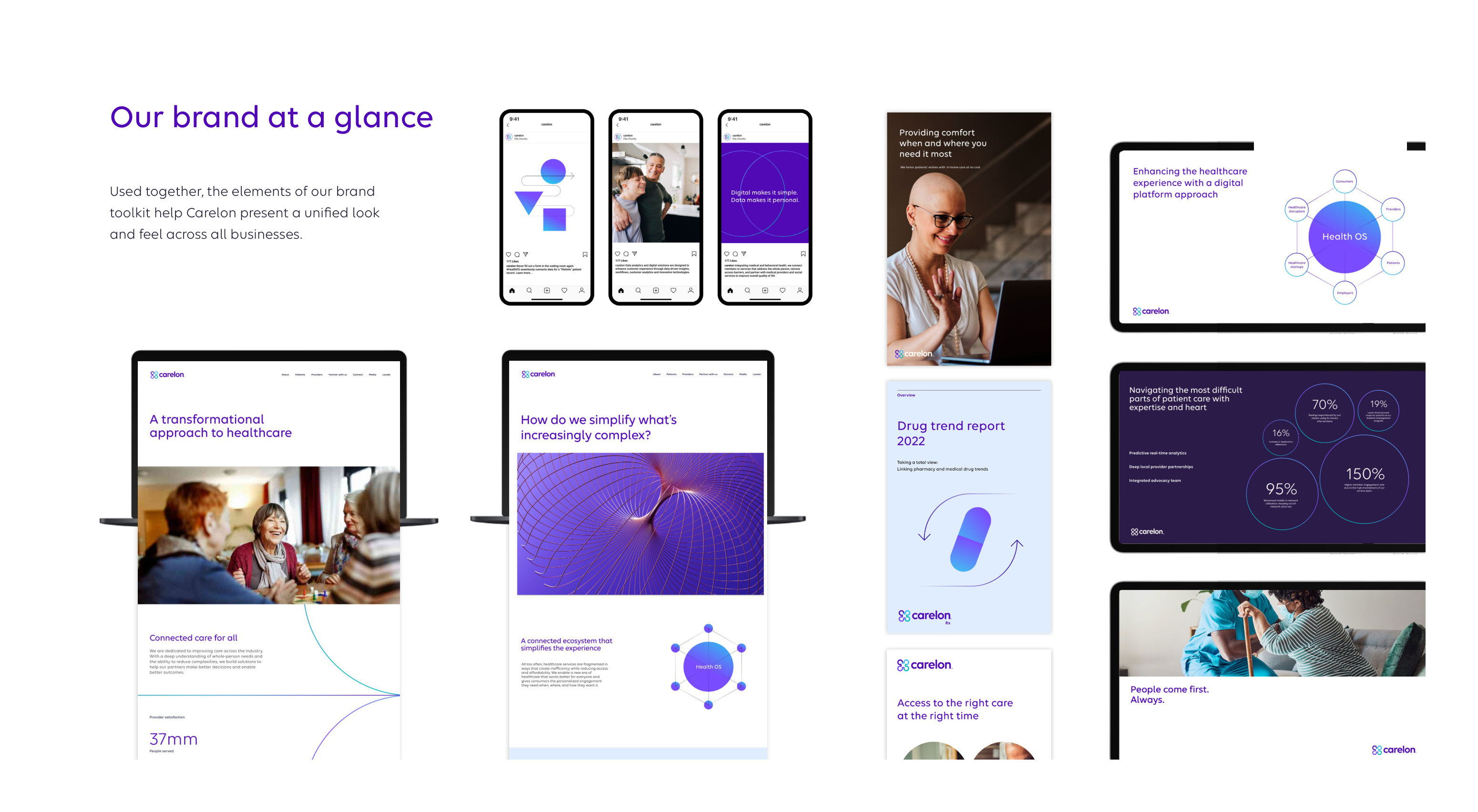
Carelon brand guidelines — the brand at a glance: web, social, print, presentations and app, all on one system
Where it all had to land. The enterprise system across every surface at once — web, social, print, presentations, app — and the target that 1,500+ Beacon pieces had to be carried into.
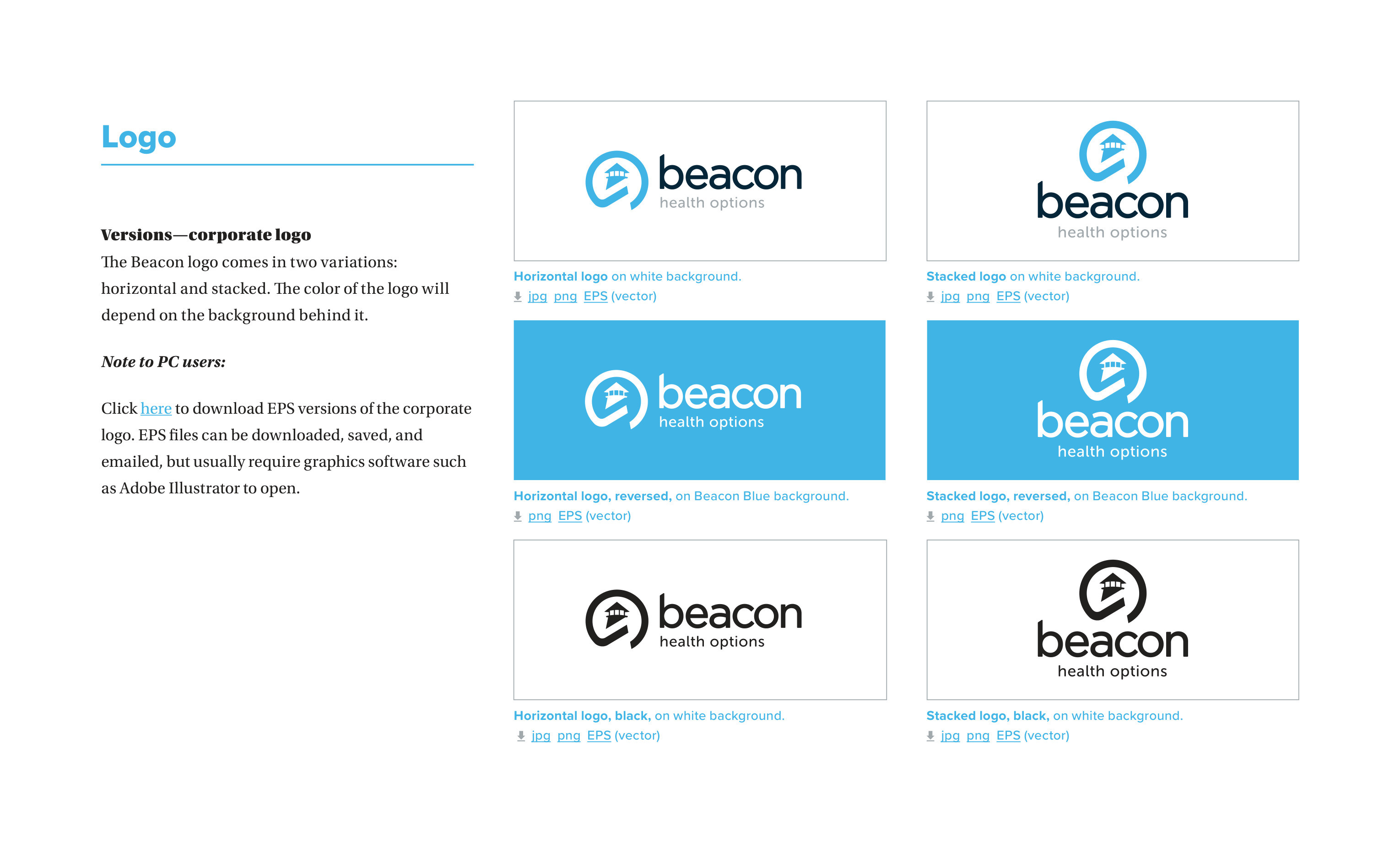
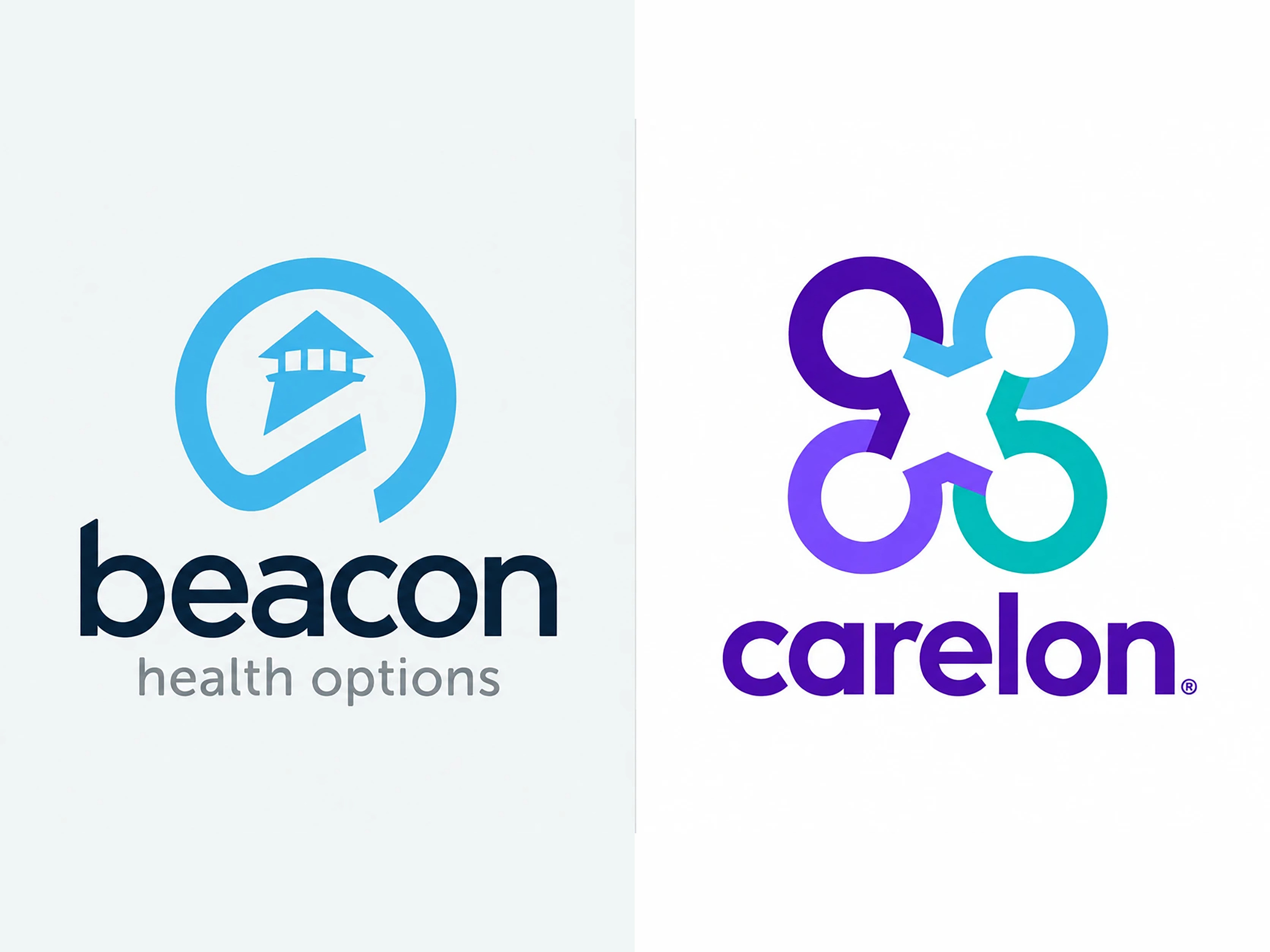
Before — the Beacon logo
Beacon Health Options brand guidelines — the corporate logo in its horizontal and stacked versions, positive, reversed and black
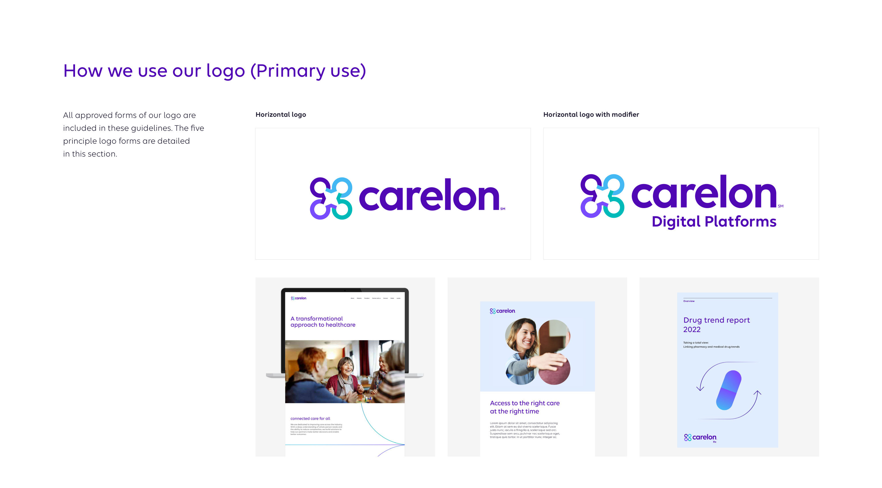
After — the Carelon logo
Carelon brand guidelines — how we use our logo: the horizontal logo, the logo with modifier, and the forms in use
The mark. Beacon's lighthouse in Beacon Blue, two versions and three colourways; Carelon's interlocking Cs, a governed family of forms with a modifier for every line of business.
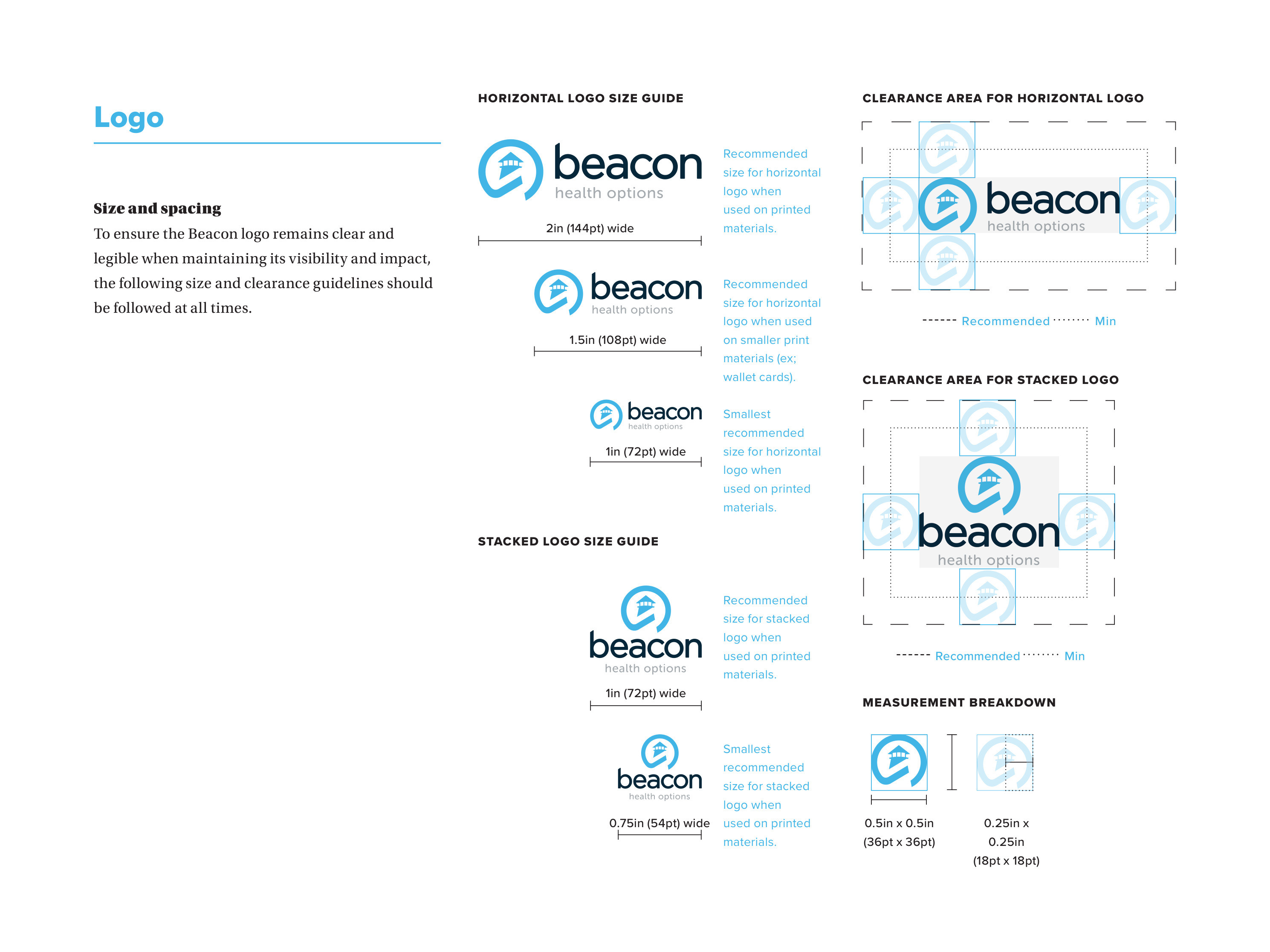
Before — sizing and clearance
Beacon brand guidelines — logo size guides and clearance areas for the horizontal and stacked logos
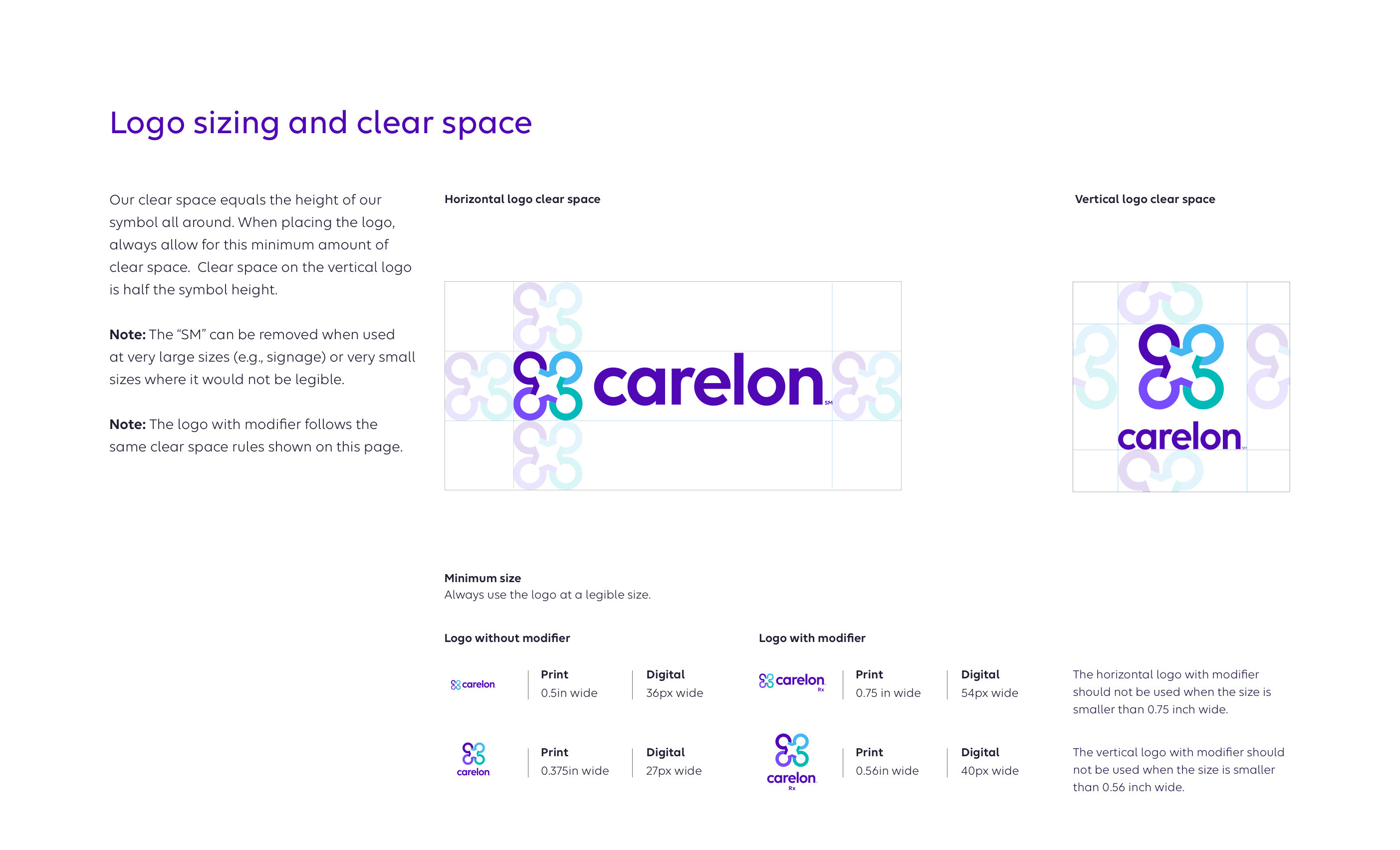
After — sizing and clear space
Carelon brand guidelines — logo sizing and clear space, with minimum sizes in print and digital
The rules that matter at volume. Both systems set clear space from the symbol itself and minimum sizes in print and on screen — the constraints every one of our templates had to honour without anyone checking.
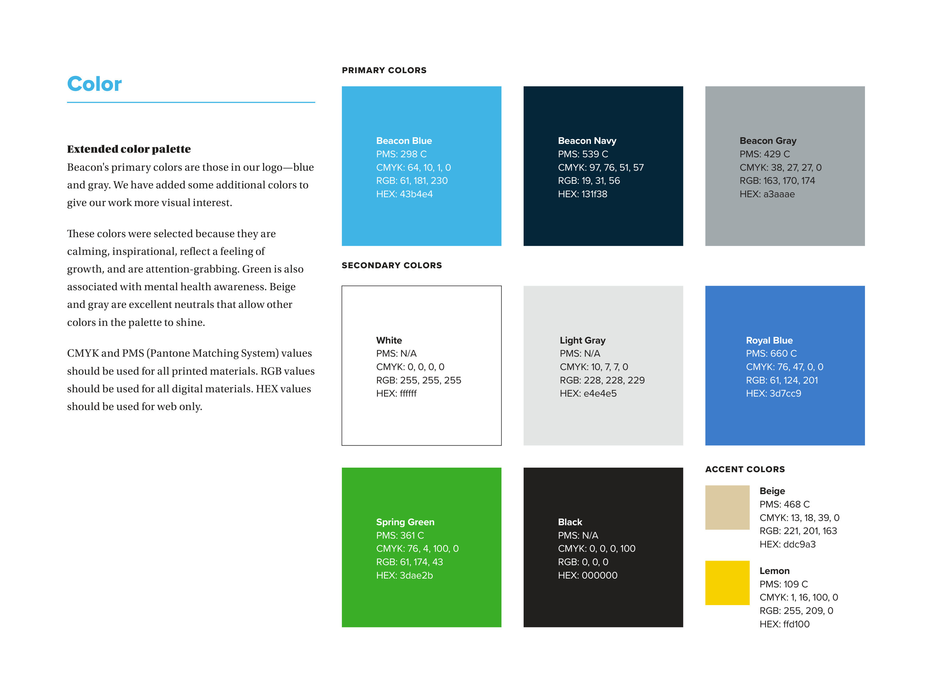
Before — Beacon colour
Beacon brand guidelines — the extended colour palette: Beacon Blue, Navy and Gray, with secondary and accent colours
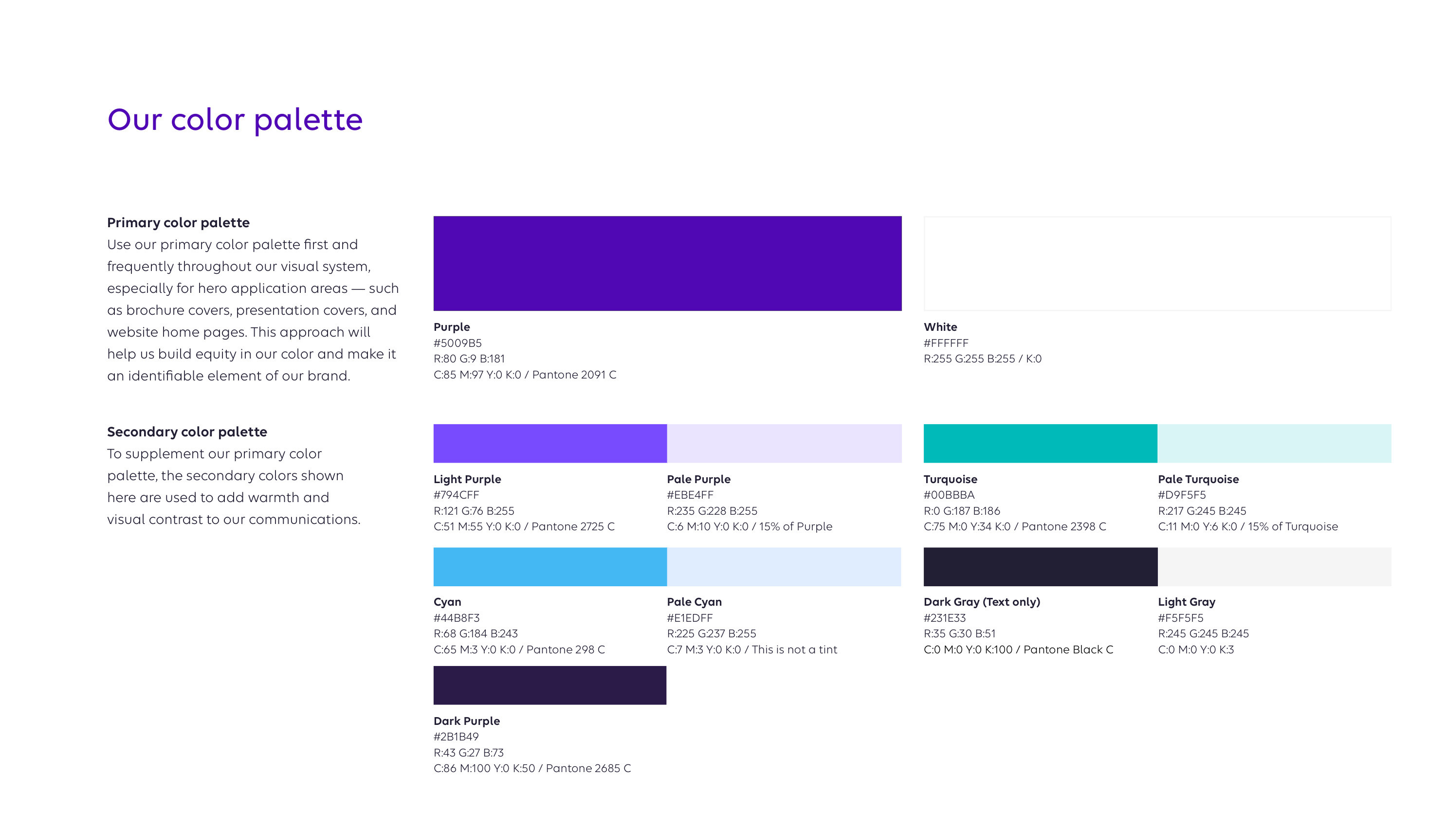
After — Carelon colour
Carelon brand guidelines — the colour palette: primary purple and white, with a secondary palette of purples, cyans and greys
Colour. Beacon ran on a calming blue with green, beige and lemon for warmth; Carelon leads with purple and builds out through cyan, turquoise and a set of greys. Every template's swatches, tints and chart colours had to move with it.
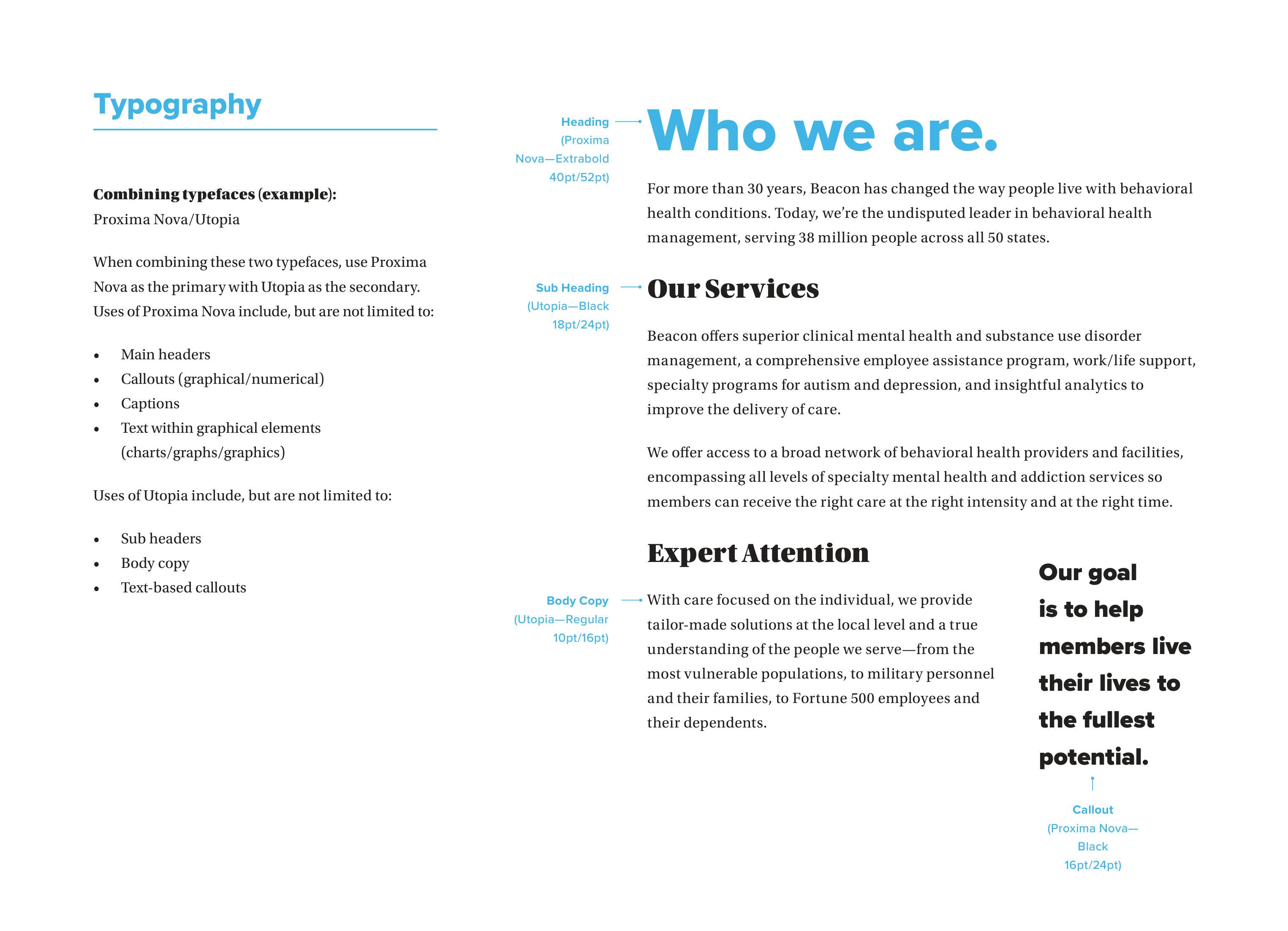
Before — Proxima Nova and Utopia
Beacon brand guidelines — typography in use: Proxima Nova headings with Utopia body copy, on a Who we are spread
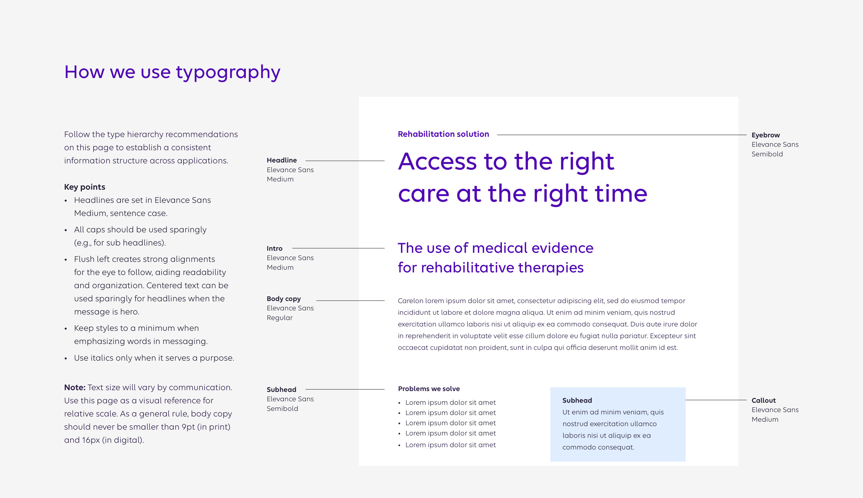
After — Elevance Sans
Carelon brand guidelines — how we use typography: Elevance Sans across headline, intro, body and callout
Type. Beacon paired a sans for headlines with a serif for reading; Carelon set everything in one proprietary family, Elevance Sans, in sentence case. Paragraph styles across ~1,500 documents were rebuilt to that hierarchy.
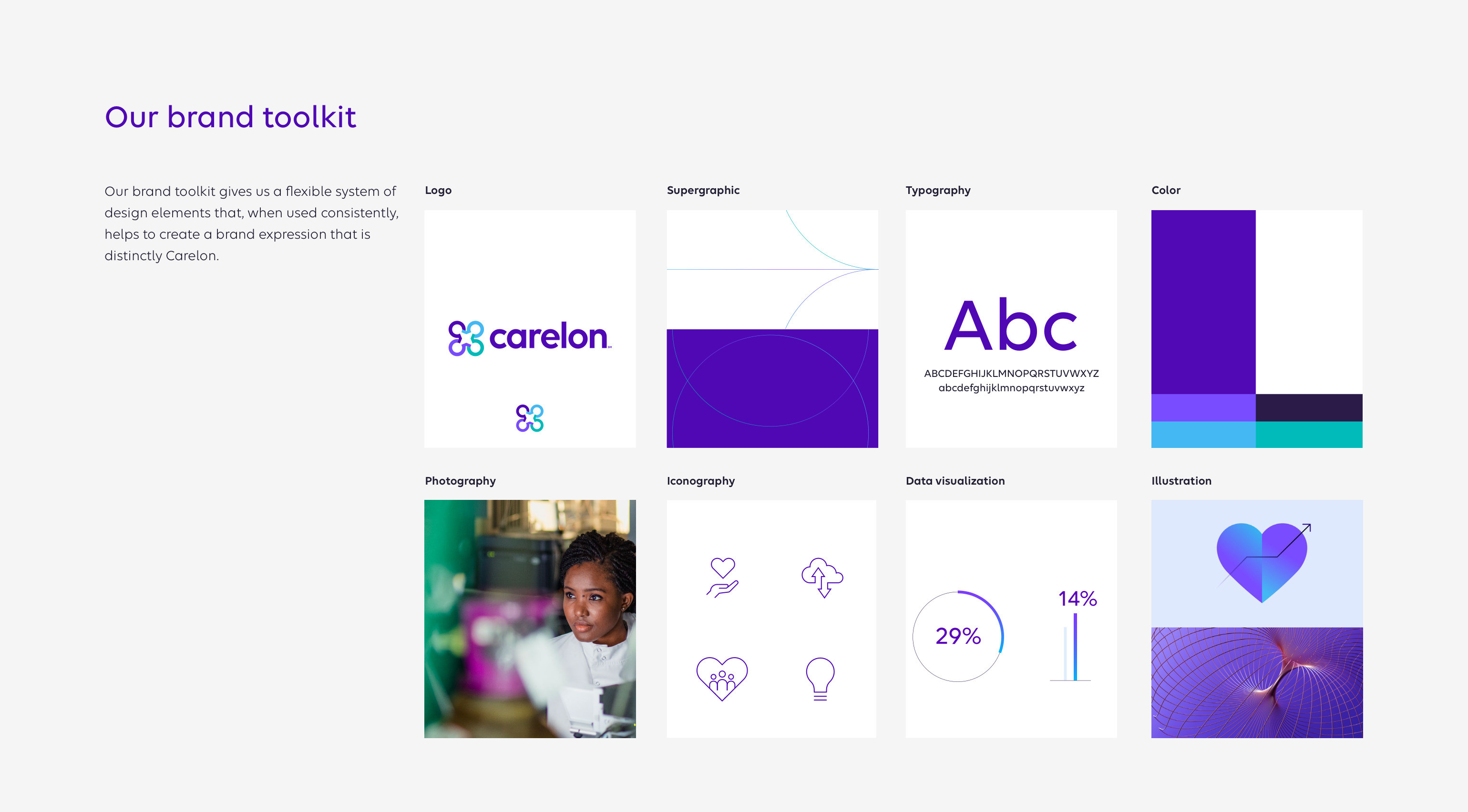
Carelon brand guidelines — the brand toolkit: logo, supergraphic, typography, colour, photography, iconography, data visualisation and illustration
Eight elements in the toolkit — logo, supergraphic, type, colour, photography, iconography, data visualisation, illustration. Every one of them had a Beacon equivalent to retire, and a template to rebuild.
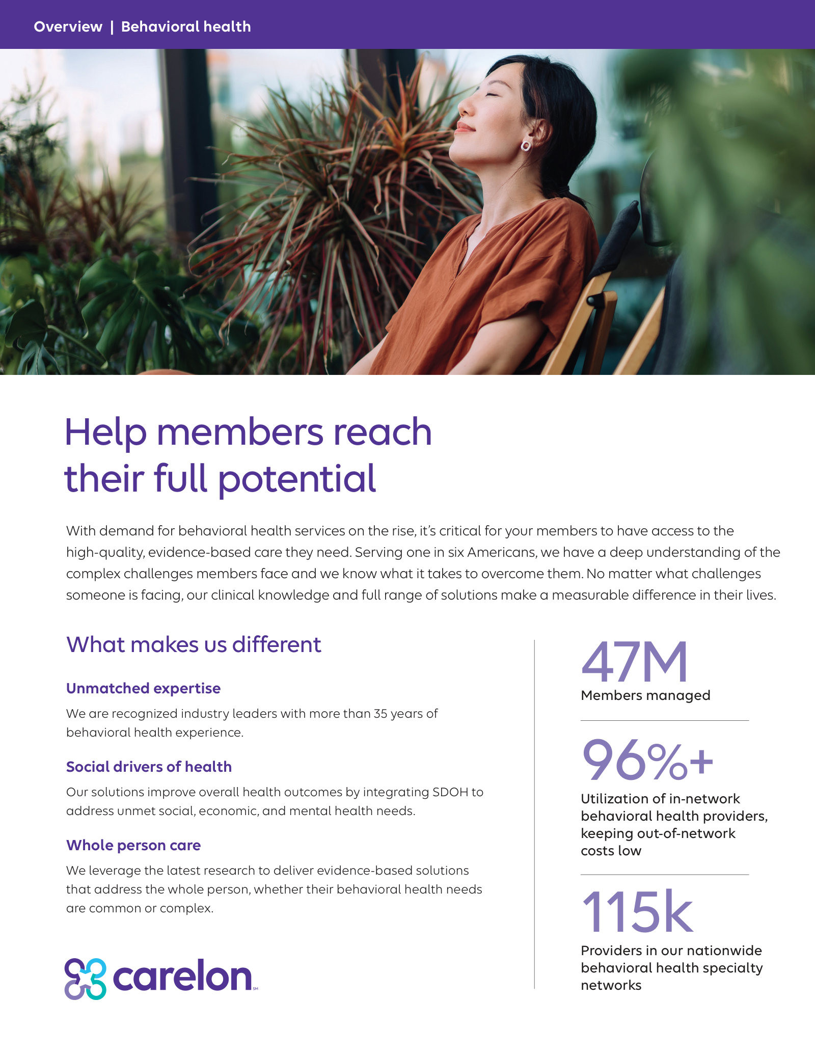
Sales sheet
Carelon Behavioral Health sales sheet — Help members reach their full potential
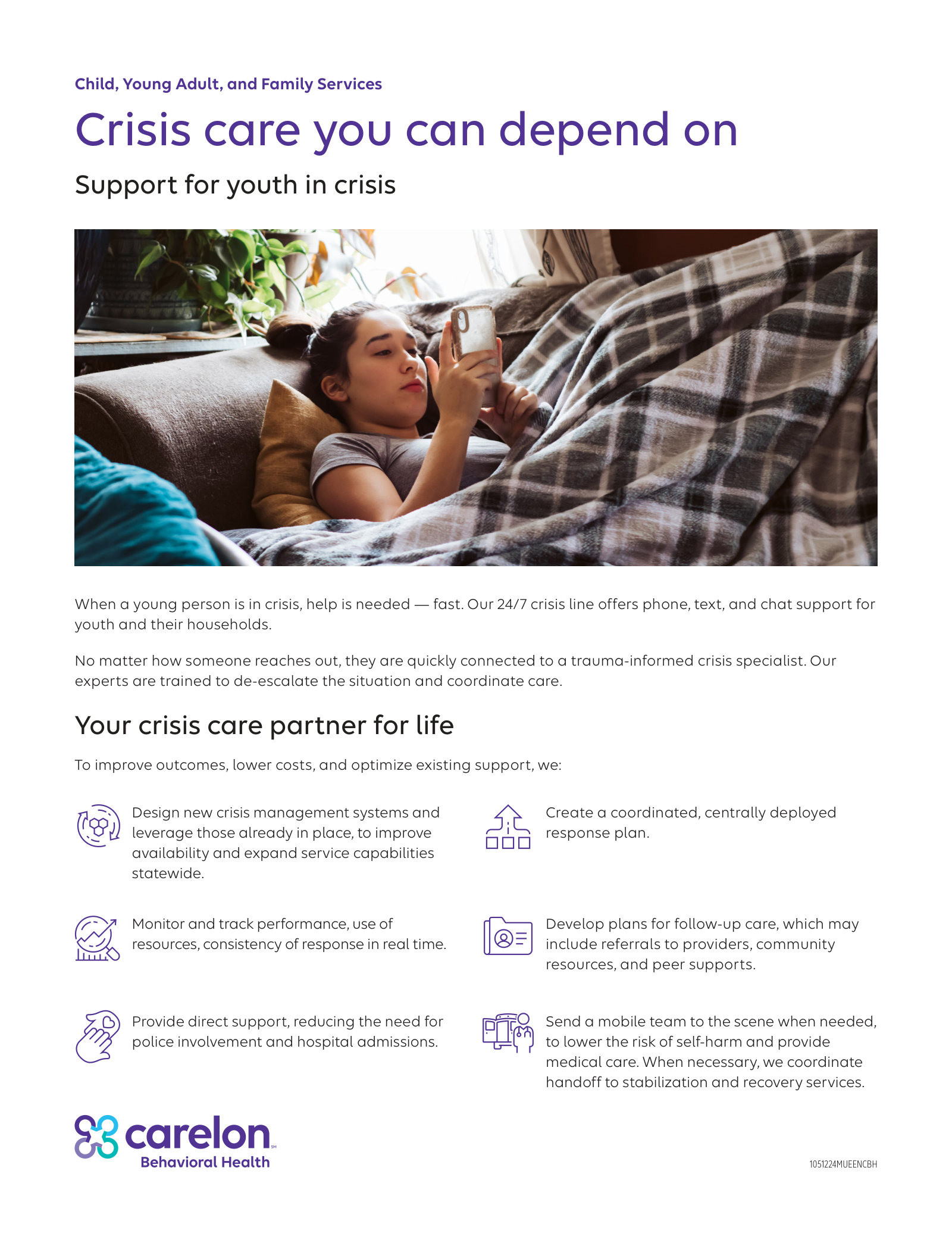
Crisis capability sheet
Carelon Behavioral Health crisis capability sheet
What the team built with it: market- and member-facing collateral for Carelon Behavioral Health, carried across from Beacon without losing the plain language people rely on.
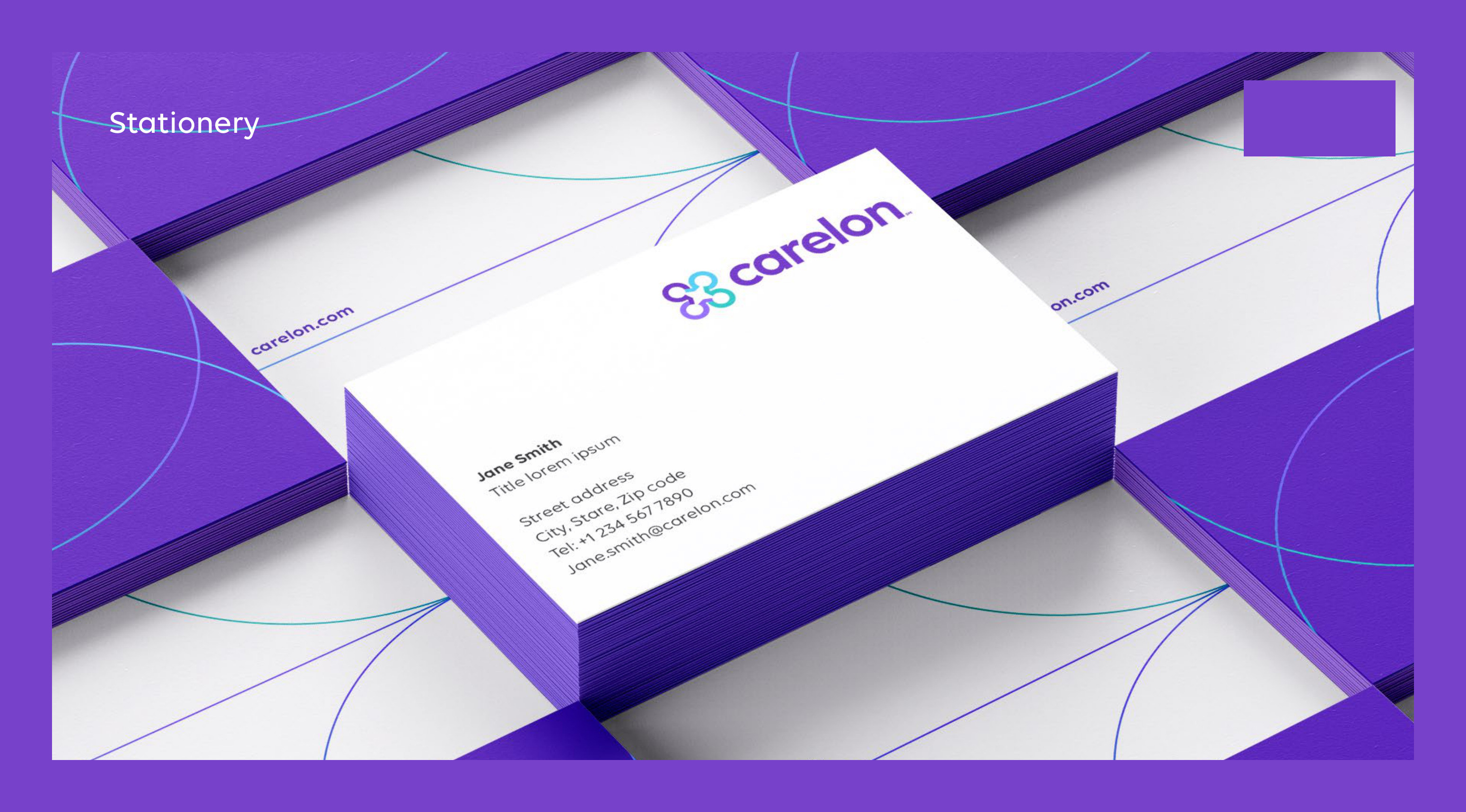
Stationery
Carelon brand guidelines — stationery: business cards and letterhead on the purple supergraphic
Environment
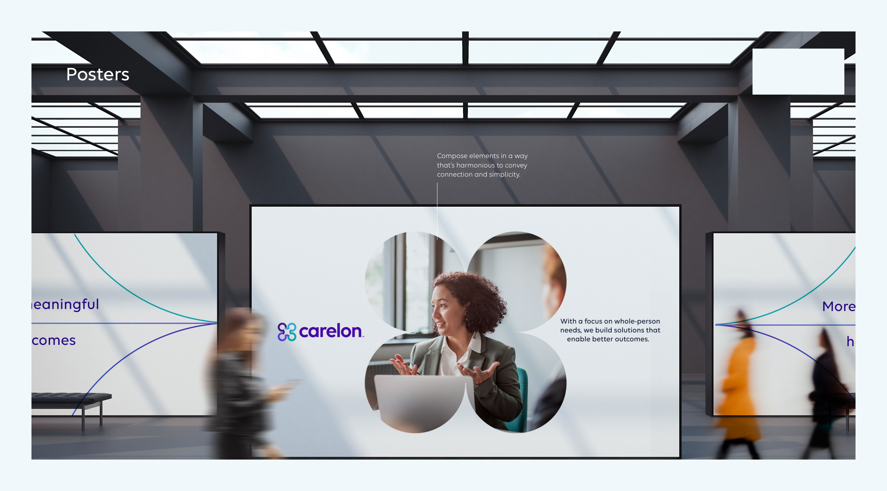
Carelon brand guidelines — posters in an office lobby, the supergraphic at environmental scale
The system at its smallest and largest — a business card and a lobby wall — and the reason a template library had to hold together across every one of those sizes.
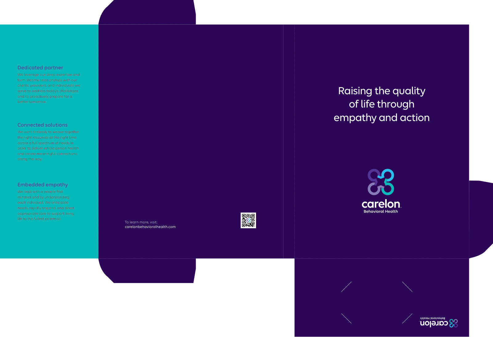
Carelon Behavioral Health pocket folder design
The pocket folder — the piece that carries everything else into a meeting, rebuilt on the new supergraphic.

// The mandate

As Creative Director, I led the transition end to end on the Beacon side: reading the enterprise brand system into Carelon Behavioral Health's design system and templates, directing vendors and partners, rebuilding merchandise, and standing up a print-on-demand platform from scratch — everything between the guidelines and a finished piece in a member's hand.

// John's role

  • ↳Translated the enterprise brand system into Carelon Behavioral Health's own guidelines and application rules
  • ↳Built the design system first, then the templates the work would run on
  • ↳Directed vendors and partners; rebuilt merchandise and the print-on-demand platform end to end
  • ↳Managed 3 in-house designers, a video production artist, and a team of project managers and writers
  • ↳Ran a near-daily cadence and a live progress dashboard to keep hundreds of deliverables on track

Worked with

  • ↳3 in-house designers
  • ↳A video production artist
  • ↳Project managers and writers
  • ↳Creative Circle freelancers — the team scaled to ~20 people across the year

// Key decisions

01

Build the system before the assets

The enterprise handed us the identity — logo, palette, type, supergraphics, imagery rules. Rather than migrating piece by piece, I built the Behavioral Health design system and templates on top of it first, then produced against them. Slower to start, but it made ~1,500+ deliverables repeatable and consistent as volume spiked.

02

Batch the work to make it finishable

Hundreds of deliverables are overwhelming as one list, so we batched them by type of piece, client, and product and worked through them in waves — steady, measurable progress instead of drift.

03

Scale the team, and keep it in sync

We brought in Creative Circle freelancers, scaling to ~20 people, and held it together with near-daily check-ins and a shared progress dashboard so everyone could see exactly where things stood.

// The outcome

  • ↳~1,500+ brand assets migrated to the new identity across the organization
  • ↳Merchandise and the print-on-demand platform rebuilt end to end
  • ↳The full rebrand delivered in ~9 months with a team that scaled to ~20

// Reflection

What I'd change: stand up a single shared project-management system from day one so everyone stays on the same page and can see progress. What it taught me: hundreds of deliverables look overwhelming on paper, but with the right system and the right people, you chip away at it — and finishing something at that scale is its own reward. This is the project that changed how I lead.